Have you ever wondered why do some people make really good pictures, while others given better camera, the same topic, better light and other advantages never manage to get close to good, not to mention perfect?
Rule one: It is the human who's making photos, not the camera, so no matter how good your gear is, photos made with it without thinking will never be as good as the ones made with taking some time and thought.
Rule two: Cameras see world differently than we do. They do not think, so it's up to you to make the photo carry a message. In other words: Get to know what are you shooting before pressing the button.
Rule three: Composition is the key.
And that brings me to the point I've been thinking about lately. There are many very good manuals about composition in photography. What I wanted to do here is give some examples and sum up the most basic rules.
Images are generally:
Lines - Most often not real contours, but lines made by your eye and brain.
Colours - Less important in black and white photography, in colour one it's considered the main mood builder
Lights and Shadows - Often more important in BW photos, those are equally important in colour photos as colour itself.
These elements build space, textures and forms. And it was noticed long time before that humans generally find some arrangements of those more dynamic, while others are considered more static. Some images can be disturbing without even containing any really odd elements.
1. Open and Closed composition.
An example of an open composition is such, that gives the viewer this gut feeling that there's more to see, something is maybe hidden, or not entirely visible or simply unfinished. Open compositions can be both relaxing (seaside) and disturbing (an old bridge cut in two)
Closed composition on the other hand is a finished or enclosed item being the topic the of image. Also in this case it depends on the item itself, be it a running human or a sole tree, to be the main carrier of the mood.
As you will see in the examples there's more to it, than just dry definitions.

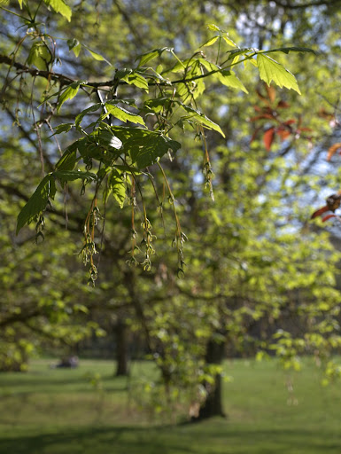
This is a closed composition, even though the branch is cut off and there's more in the background. The main topic however (the bunch of leaves on top of the twig) is "finished" and background is just forming blurred canvas.

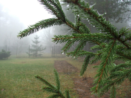
Branch again, and blurred background, yet this is an open composition, cause there's something in the back, and who knows maybe it is even more important than the wet greens in front? Such photos leave your imagination a bit to ponder upon.
2. Dynamic and static compositions
One could think that dynamic compositions are those of sports events and static are lakes and buildings. Nothing more misleading!
Long time ago some wise people have found out, that straight horizontal or vertical lines feel more stable, while diagonal, or askew images feel dynamic. Delicate curves create the feel of soft movement. In other words you can get a dynamic composition photographing the tree in your garden and a static one portraying children in the playground.
3. Example composition techniques and common rules
Of course there's more but keeping to these can help making your photos better.
Rule one: Image should have some point of interest, otherwise it's turning into a mixed up carpet-like pattern.
Pretty leaves, but what is this photo about exactly? Dullness?
Ugly planks yet this one is much more interesting even though it's far from pretty or perfect.
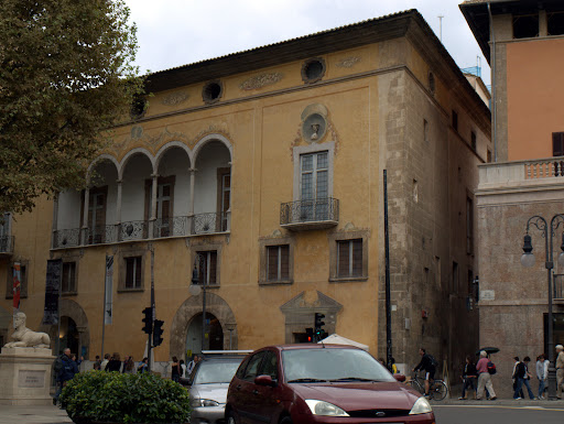
Rule two: Watch out for clutter. Your brain is able to simply omit people to the side of picturesque tree or a car in front of an antique entrance to some museum. Your pictures will show them all.

Wow, a Ford in the first plane. Not really the topic of the photo, but you can't fail to notice it...
Rule three: Bisections are evil. Unless you want to emphasize symmetry (or stunning lack of it).

Right... This is not about the sunset, as the sun is too far to the left. Nor about the stunning sky, cause we see too much of the swimming pool. And the pool itself is not pretty enough (or lit enough for that matter) to make it an excuse for this shot.

Everything is slightly off the middle making this photo a much interesting image.
As you see all rules have exceptions, but unless you know what you're doing (being a seasoned photographer) avoid them.
None of the above photos are exactly perfect. The purpose of this "manual" is to show pictures such as everyone has on their hard drives, Hence no really stunning master-works. Also all of them are mine :P
Now to the point. Most common techniques:
Rule of thirds - So easy and so popular almost every camera today has the ability to display an overlay grid for you while shooting.
The idea is simple: Divide your image in 3 horizontal and 3 vertical columns and place point of interests, mood changers on the lines or intersections of lines making columns(called strong points).

horizontally: pavement in the bottom part, sky in the upper one, middle is for buildings.
vertically: left: brighter part, right: dark part.
point of interest: lantern on the intersections of the upper and right columns.
Rule of odds
Essentially this rule suggests that an odd number of subjects in an image is more interesting than an even number. The other interesting point made by this rule is that an object surrounded by an even number of equal objects (person in the centre with two other persons to the side) creates a visual feeling of comfort, while the same object in solitude is considered disturbing (a lonely tree in the field).
Golden ratio
Maths apart (you can read about it here), this is one of the oldest composition rules, for centuries considered the perfect way of composing such various things as buildings, images and even found in nature.
The idea here is to not only divide the image in a way described by the rule (the ratio of the entire image to it's bigger section is the same as the bigger section to the smaller section), but also to make the smaller section more crisp, or have the point of interest there, while the rest of the image is more blurry, or contains less edgy or heavier counterpart.
Now the funny thing is, that the rule of thirds is a simplified version of the golden ratio. Why is it still working then? Because all these rules are more of a guidelines. You do not have to create an exact match with the strong points to have the photo working. Nor have you to get something in every strong point.

An example of exact golden ratio image trisection. There is only the ladybird in one of the strong points yet still this photo is not a bad one.
Some more advanced techniques involving golden ratio use Fibonacci spiral:

Or skew the division to get more dramatic effect.
Last word: These are only suggestions. By no means you're asked not to try to be more creative. But if you feel your photos are dull and lack that "something", then this is a good starting point.
